
Soil stability analysis
Posted on .
As a consultant through ALTEN Nederland, I’ve helped the teams that develop the scientific software for the assessment and design of embankments. The products enable engineers to analyse soft soil stability, groundwater flow and settlement. As part of the Dutch government’s BOI programme, these products help keep the Netherlands safe below sea level. I’ve introduced an agile way of working that includes user involvement through UX research. My introduction of a company-wide design system has increased co-creation and knowledge sharing. I’m proud to have played a leading role in this programme, as it has set an example for future product development at Deltares, with a global impact.
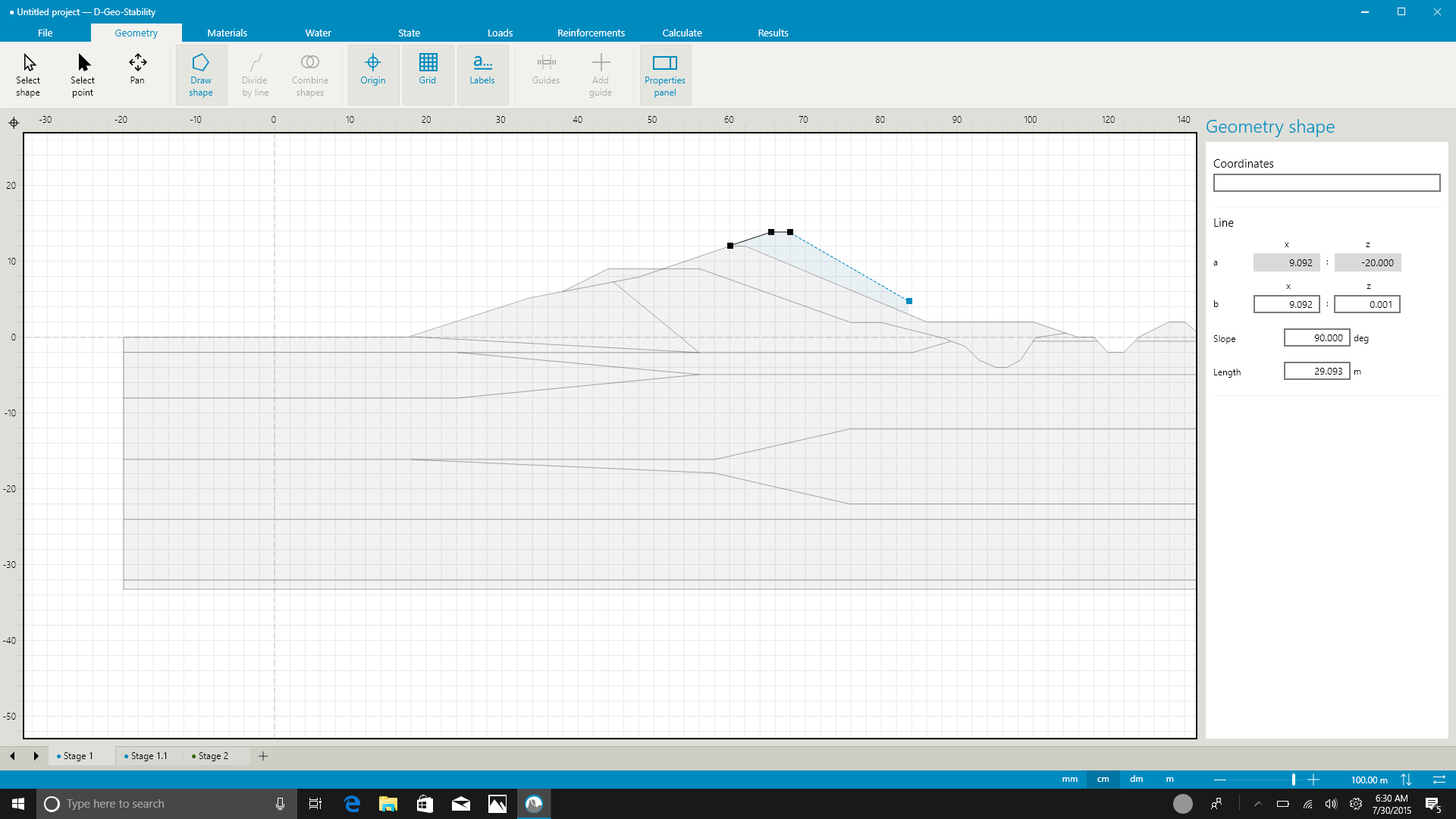
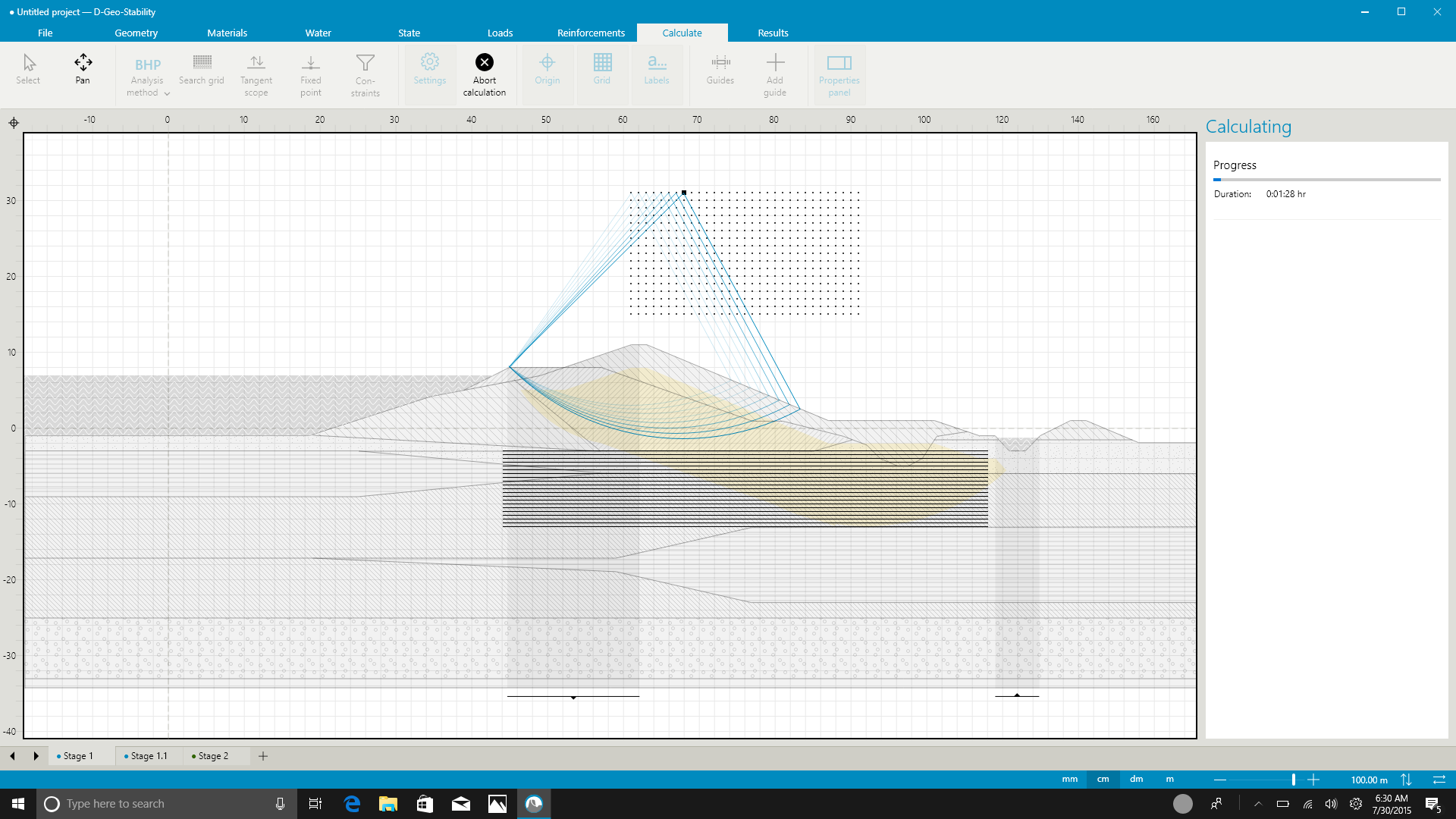
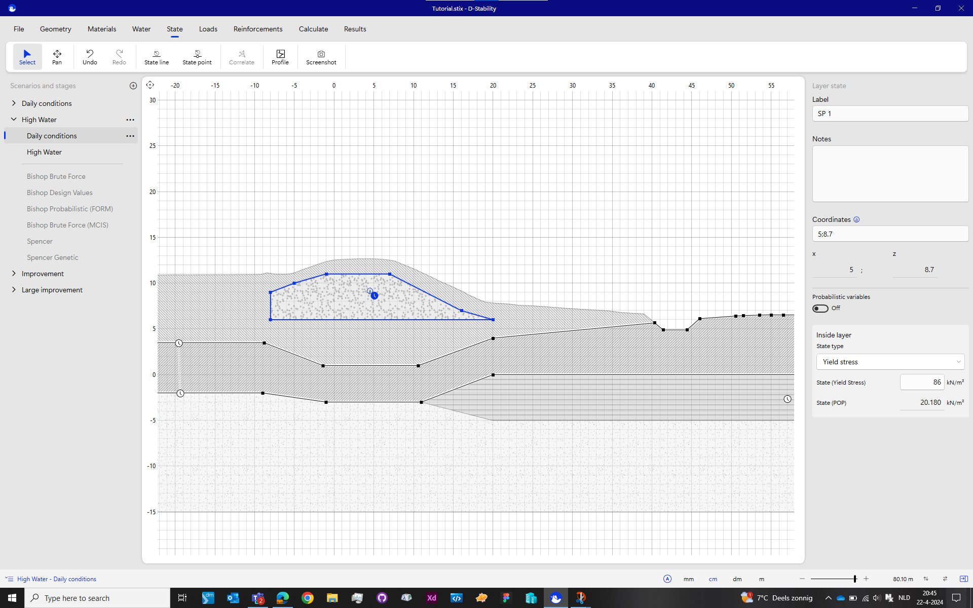
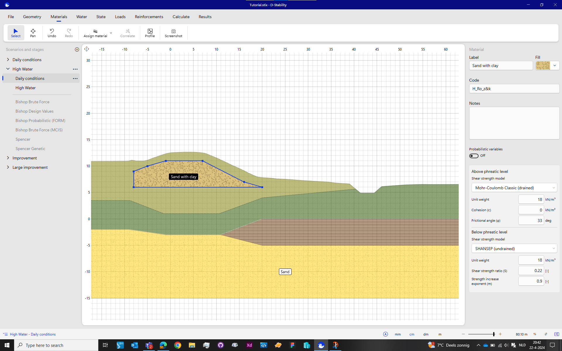
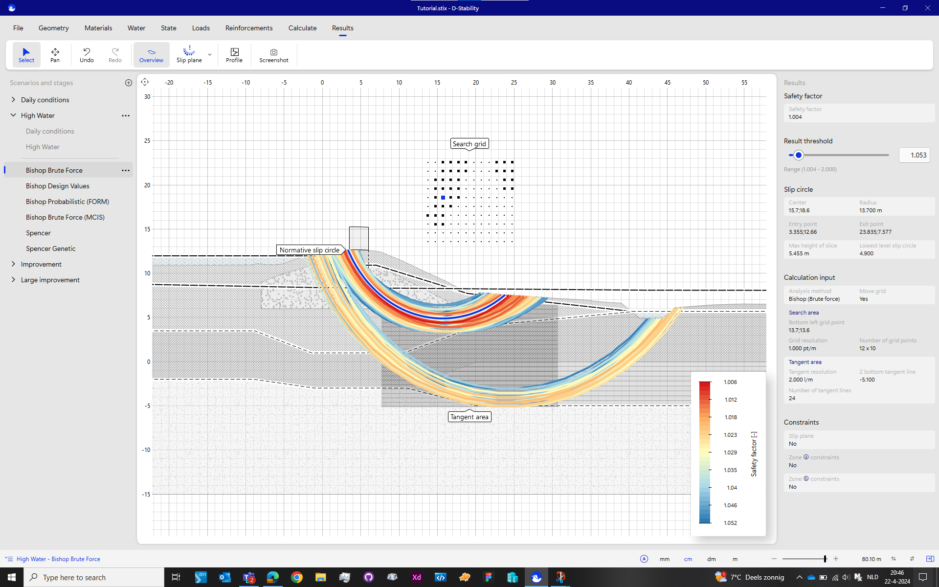
The Netherlands is known for its water management as a huge part of the country is situated below sea-level. Deltares is a knowledge center and worldwide authority on the topic of water safety. Through the BOI program, the Dutch government ordered Deltares to create and share knowledge and software tools to assess and design embankments to keep The Netherlands safe from water. One of those tools, D-Stability, is focusing on soil stability. It is used to calculate the risk of failing embankments/dikes by running various scenarios with numerous parameters.
Blind start.
Back in 2017 I was asked to join the newly formed development team to rebuild the existing product and make it ready for future developments. I was thrilled to be asked to join them. I was the sole UX-professional within Deltares; my lobby for UX had been effective. For me it was the first desktop application at Deltares, I had done only web and game projects so far. To get familiar with the company’s branding and design standards for its desktop software, I started some research that quickly stranded in a dead-end. I was thrown a though bone to chew on. The team had no experience with UX in their workflow and the product owner had no experience in building software products. As a team we had to find a way to work together and learn what would work out the best for everyone involved.
Setting clear product goals.
Together with the product owner and a few experts from the geo unit, I compiled a set of product and business goals the product was about to meet. At the time of compiling that list, we had no idea of how important those goals where to be in the coming years. They would guide us during planning and priority setting meetings and keep us a team and our stakeholders aligned when brainstorming.
I expected the goals that were linked to students, a section of users the existing product never had focused on, would be the most challenging. But it appeared not to be. Our biggest challenges came from the most experienced users.
Adding user involvement to the development process.
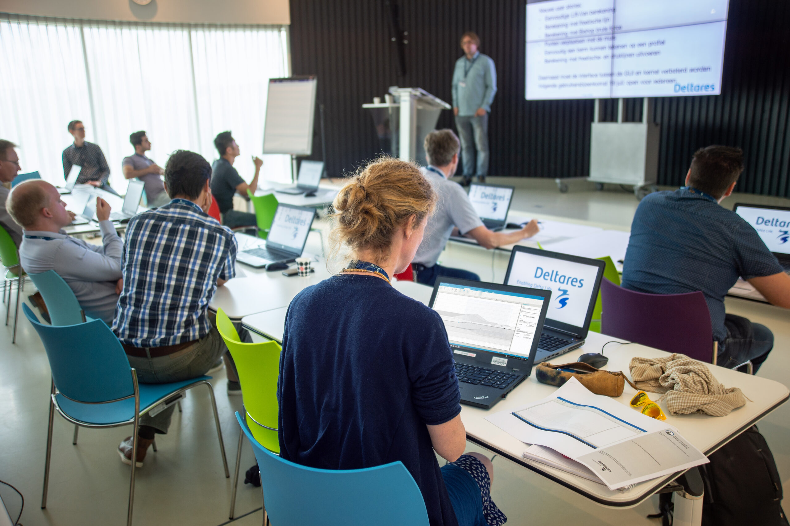
Software product development at Deltares in those days had none or at most ‘backward’ user involvement: in iterative chunks of often 6 months to a year, features where added and at the acceptance test with the client, feedback was recorded. Following changes were patched immediately or piled upon the backlog. This resulted in many hours of rework for the team, stalling progress. The team for this new project decided to change that. Together we compiled a list of things to improve and possible solutions. The outcome of many workshop-like meetings was to start a focus group of domain experts that could inform us during the design stage, before things got build, and when things where build those people could validate and advocate.
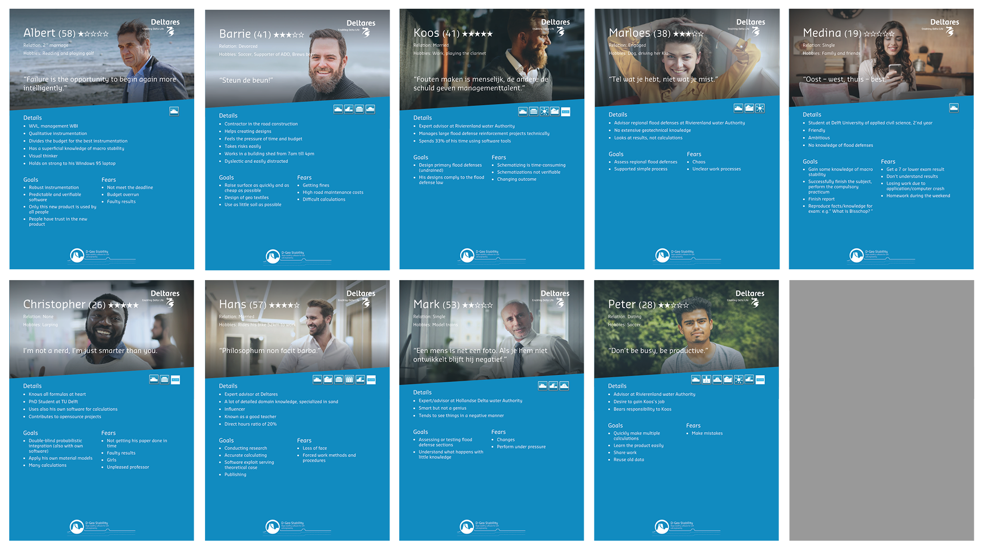
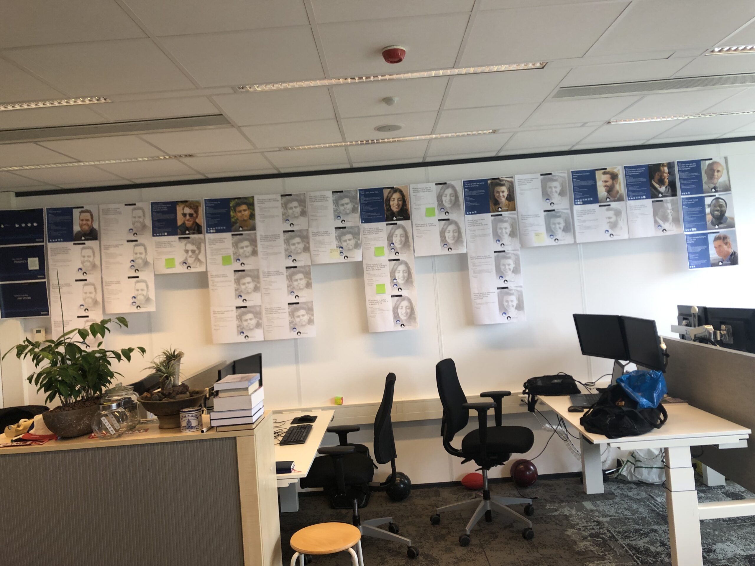
But before you can select people for an expert group, you need to know who your user is. Not one other project ever had used personas before. The ‘user’ had been a role like ‘viewer’, or ‘administrator’. So, I pitched to start using them by demonstrating how little we knew from our users. Which was a problem since we were up to create a user centered product. Luckily for us, the product owner had an extensive network to work with. In a workshop setting we (the whole team) drafted 7 personas that covered our goals. Afterwards I refined the persona’s based on data from the people in our PO’s network. For the team to emphasize with the personas, I created visual persona posters that we hung up the wall in the project room. They would turn out as discussion starters for the team quite often.
Our display of personas was also noticed by other teams. It encouraged some of the teams to start using personas. To support this development, I coached those teams on how to create and profit from personas.
We wanted to get user involvement into our development process. Therefore, we needed access to people who would be open for discussion and willing to invest in our product. To get them interested and involved, we choose to first create a bare minimal product that would prove our product vision and development philosophy. By giving them a prototype we wanted them to return feedback and thoughts. Also, we fixed some annoying bugs in the existing product, trying to create goodwill we could leverage later on.
For the presentation and distribution of our prototype we choose to organize a special event on-premises. We used that event to scan the audience and select people for our stakeholder group. In a stakeholder map we kept track of things like field of expertise and influence level. To test their level of engagement, we provided them with a set of printed screens on paper for them to draw, annotate or scribble on. Almost all people that contributed also left their contact details.
Introducing a new UI for scientific desktop software.
The introduction of a new UI branding and a whole new interaction schema led to many discussions in the organization. Most experienced users outed a lot of resistance during presentations and demos. They felt limited and restricted by the new design. And they were right; the new product design strategy was to first support and guide the unexperienced users. Later on we would add accelerators for experienced users.
The difference between the ‘old’ and ‘new’ UI strategy was huge. Where the existing product offered all data and functions into one screen, the new design offers contextual data and functions to support the user’s workflow. This makes it for experienced users feel restricted, but much less overwhelming for new users. The design uses all kinds of affordances to help the user focus on important data.
For the visual style of the new UI, I convinced the team to start using the Fluent Design system by Microsoft. This well thought (and researched) design system contains all basic components needed for a desktop application. Microsoft used it for its Office product line. Most valuable for me as UX designer: Microsoft published an Adobe XD file with all components in it. These components were also available and well documented on MSDN, a rich source for our developers.
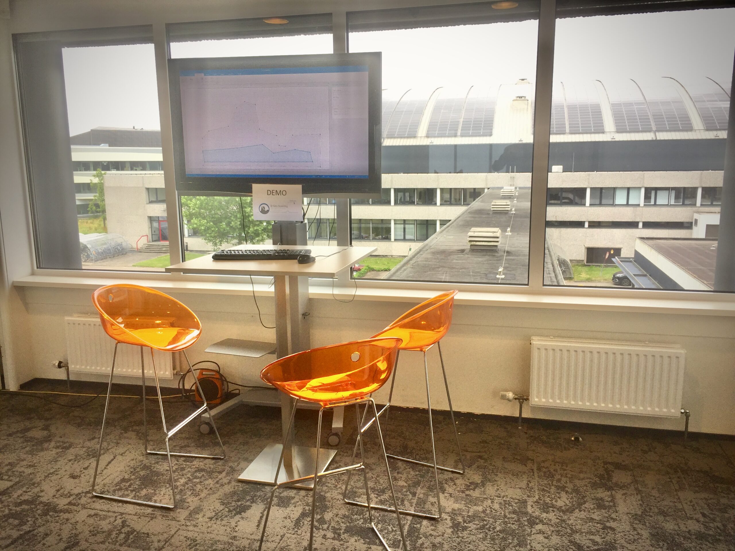
As a knowledge center, Deltares provides easy access to students in all kinds of areas of expertise. To test and verify if the new design fulfills its goals, we could simply recruit people at the coffee corners or public spaces. To speed up quick tests and demos, we set up a stand in the hallway of the team’s office. Using a large screen TV, we drew attention of people to walk up and try the new software. Stickies and pens on a table allowed for feedback when no one was around to help or interview.
Design workflow optimisation
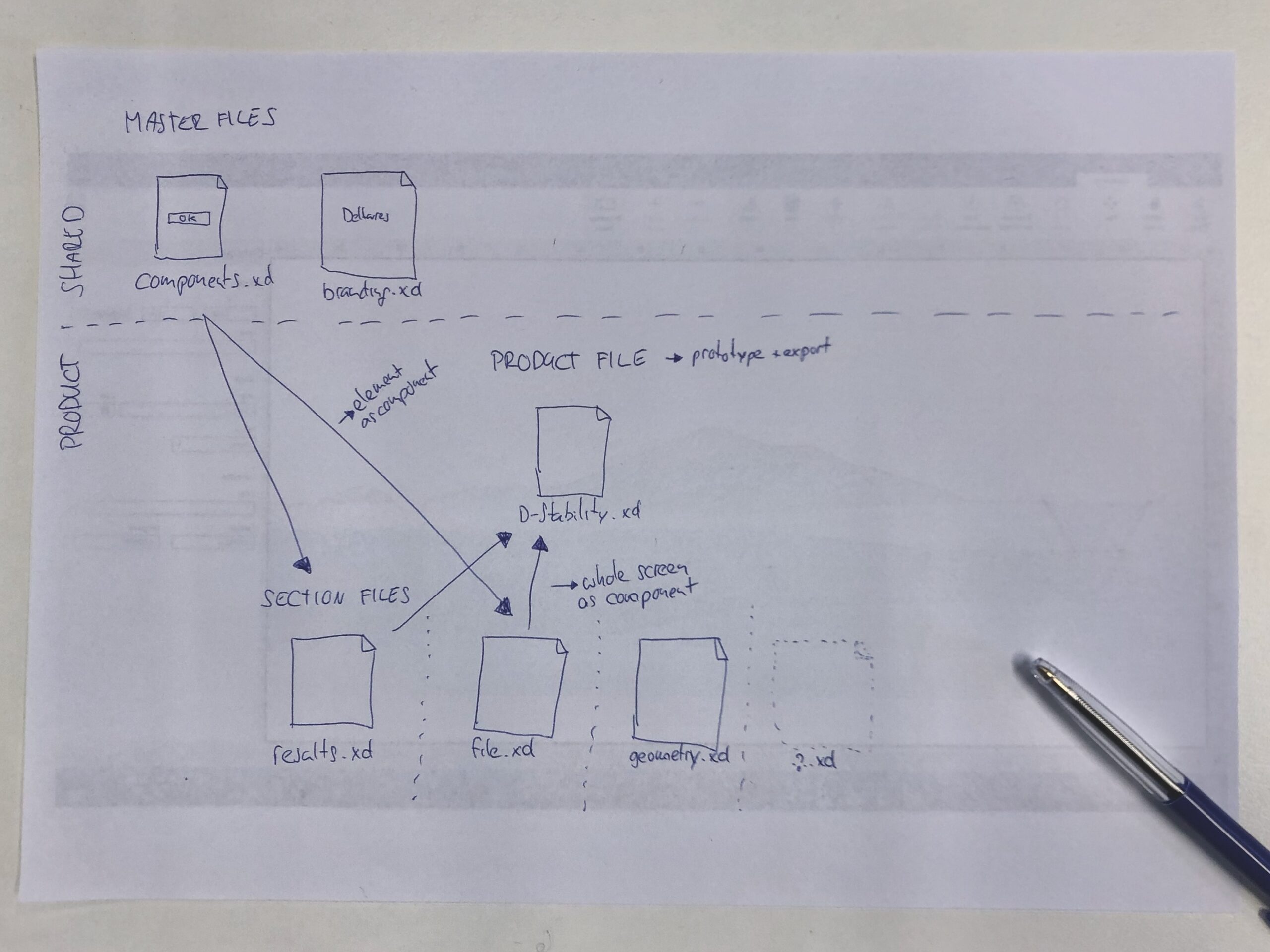
At the first start of the project in 2017 there was nothing. No current design guidelines, no style guide and no design workflow. Also, no design tools or software. As ALTEN UX-consultant I brought my Adobe account so I could use Illustrator for vector images. I chose to design in vector data as large high-resolution monitors started to emerge on desks at users. Fancy design tools as Sketch were no option, as Deltares only used Windows laptops. At the end of 2017 when Adobe released Adobe XD for Windows 10, I merged into using Adobe XD. On the Mac provided by ALTEN as my Deltares laptop was still running Windows 7 and therefore unable to run XD. The IT department from Deltares enrolled me a few months later into the Windows 10 test panel so I could use their device for my design work while being connected to their network.
Adobe XD was still very pristine in functionality, but it handled vector data at a good performance. At first. As more functionality surfaced like the use of symbols (components) and the number of XD-documents grew, at some moment I hit the ceiling of XD capabilities. My documents started to get corrupted, and performance became a problem. Even on top-of-line hardware. I had to scale down the file size (and number of elements) of my design documents somehow. The solution was a trick I’ve learned in the 90’s when I coded games on my C64: using sprites to replace repeating chunks of design that (hopefully) would never change. I used this technique especially for grids and patterns used in the schematic (technical) drawings. It shrunk my files over 60%, but at the cost of having static images in my design that would need to be replaced if something would change.
Documentation to share knowledge
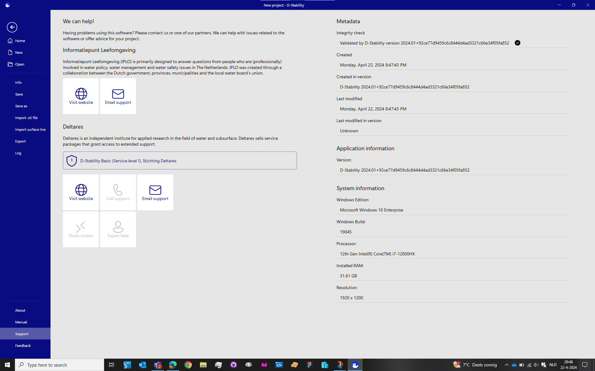
Since there was no documentation for designing software products so far, I started to create a document. It contained all my findings and decisions on the designs and listed all the guides and rules I used during design and ideation. This document started in MS Word to have it easily accessible by all other members of the product team. And again, I did meet another performance issue. Deltares at that time was still using Office 2016. And that version was not doing well handling images. In short: every image (PNG or JPG) was converted to the BMP format resulting in very a monstrous file size. The file became so big, the version control system we used started to have issues. From that moment, I moved the entire documentation into Adobe XD in a separate document. It worked well, as the functionality for sharing symbols between files became available. The cost: the document was no longer editable by others in the team, and I had to export a PDF document or prototype. There would have been alternative solutions like Invision or Confluence. But their licenses and fees were not acceptable for the team at that moment.
Developer hand-of
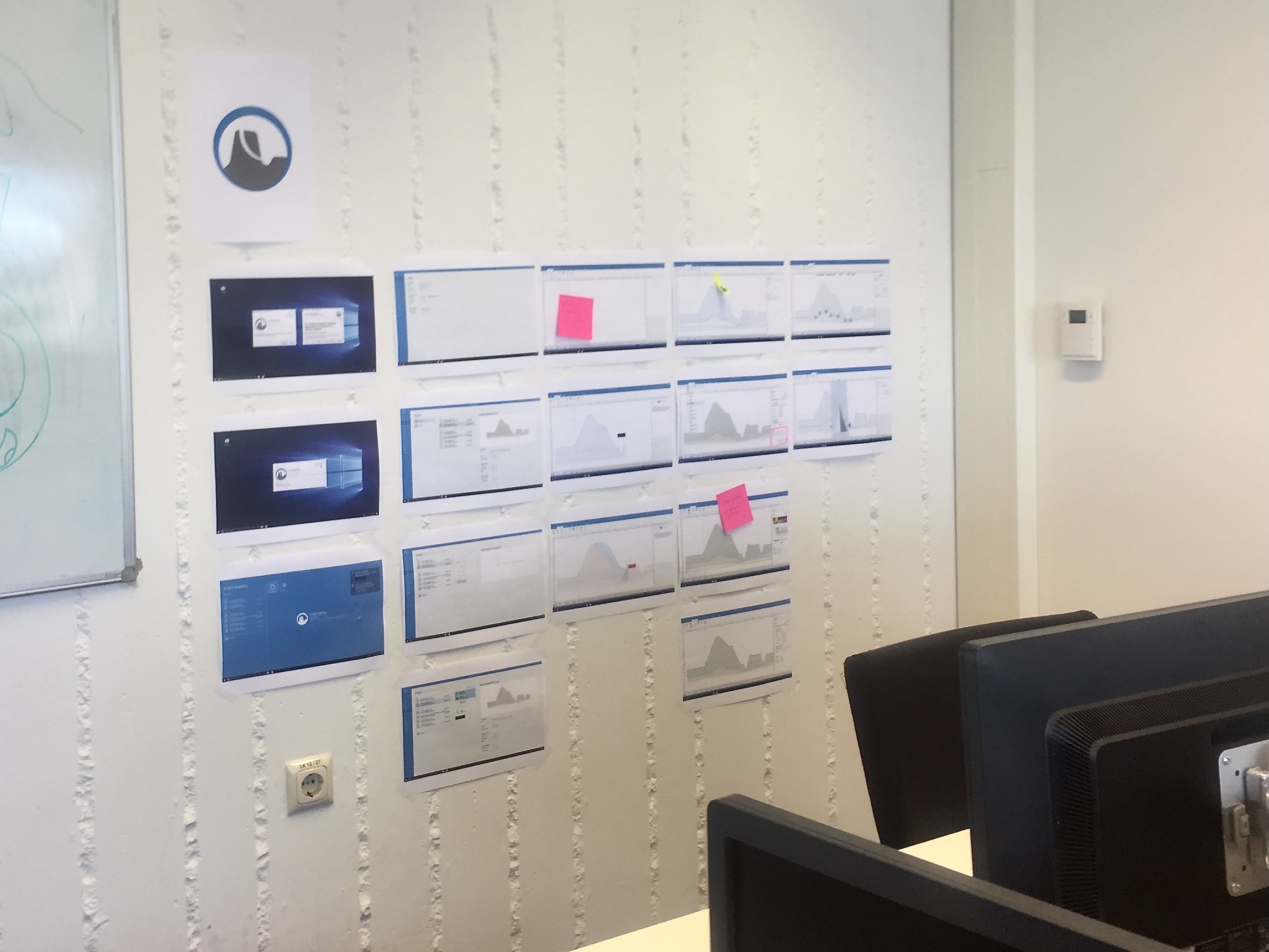
The way we organized the hand-of designs to developers evolved over time. At first, I had to spend a lot of time explaining the design to the UI developers as they had to learn and understand the design philosophy. After a while I could export entire screens to Adobe XD’s online prototype service and have them inspect the designs themselves.
Way of working
We worked in an agile way. We shaped our way of working overtime towards an effective and enjoyable set of agile ceremonies.
Together with the team we created user scenarios for our personas to add new functionality to the product. Those scenarios are too large for just one user story and covered multiple epics. We defined epics as functional parts of our software like the canvas for drawing or the toolbar. Based on these user scenarios I started my research and ideation to explore solutions. Together with the PO I presented the possible solutions to the team and together we compiled a set of user stories for development.
Dependent on the topic itself and user acceptance risk of the new functionality we pitched our solution to the stakeholders for feedback. If we didn’t want to wait for the next stakeholder session, we had a group of super engaged stakeholders at hand for direct questioning. During the regular stakeholder sessions, we would report our findings and revisit the topic with the entire audience.
Design highlights
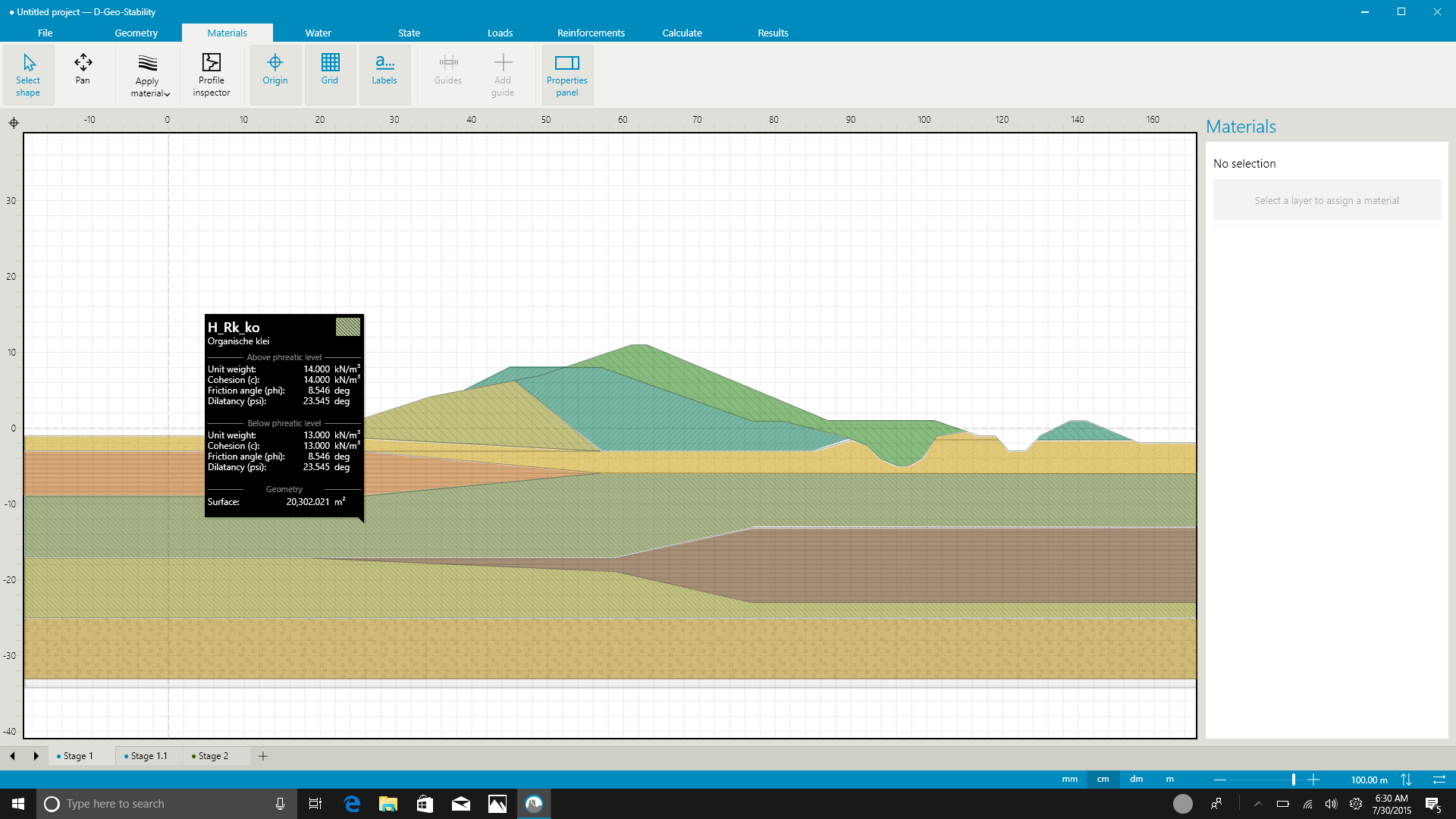
The presentation of materials by color and patterns has no wide accepted ISO norm or standards. Only for the patterns there is a pseudo standard. In de new design, the software only offers a predefined set of colours and patterns.
Rebranding 2020
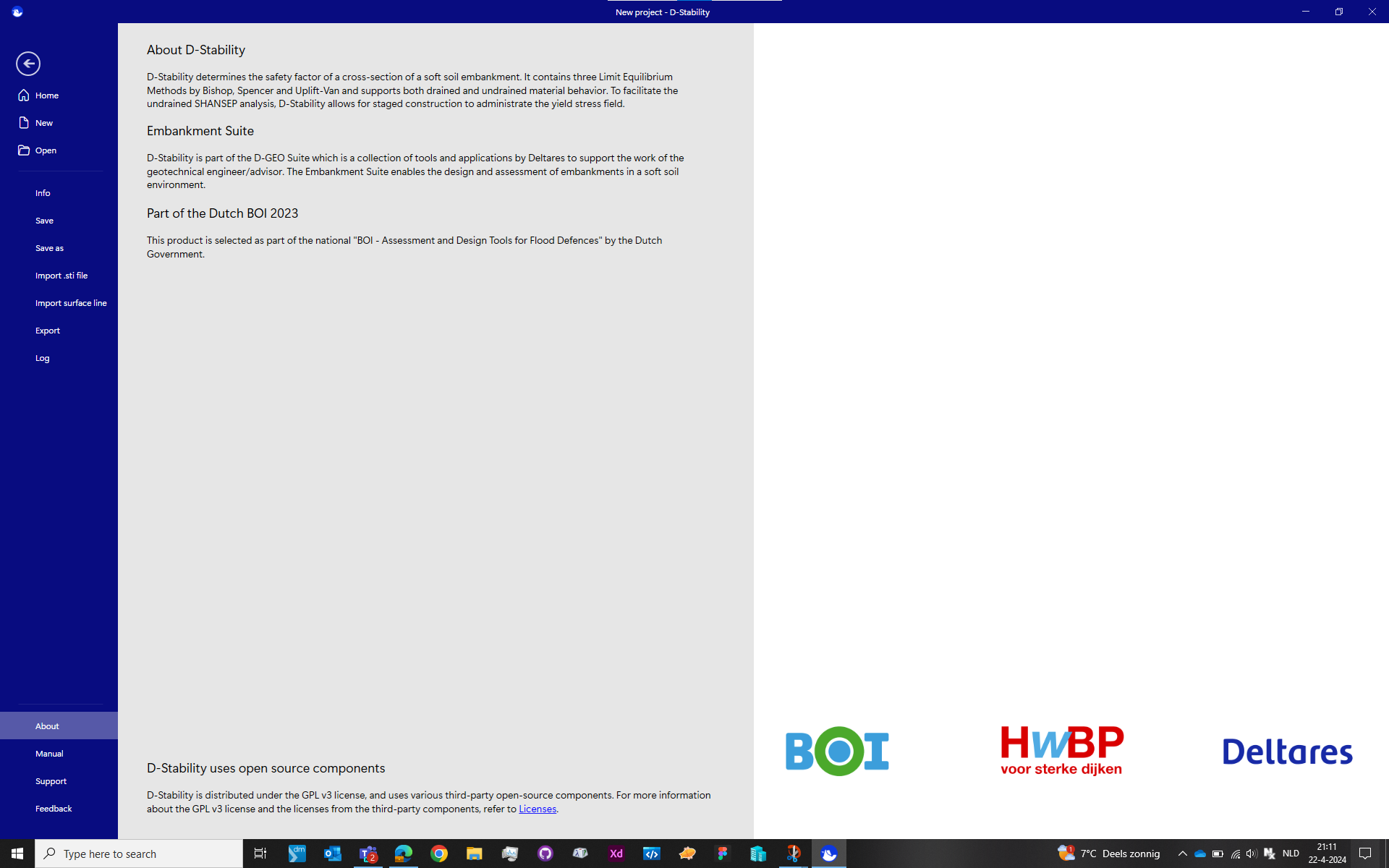
In januari 2020, Deltares started using its new branding that came with new brand colours. To keep the software in line with its branding, the design was updated towards the new branding and latest Fluent design (Windows 11).
Comments
I’ve added additional images from the 2020 rebranding.