Tender and project management software – IBIS 2.0
Posted on .
My first assignment as UX consultant at ALTEN started as a web development position. It was intended to be a two-month project to help the client. But I noticed room for improvement in the product: it would be the start of a 5-year journey.
While I quit my job at Yoobi, where I was creating software for businesses to support their internal processes and intended to work in the technology sector, this assignment at Deltares was verry similar of nature. However, I saw many interesting opportunities within Deltares for UX. I indented to obtain UX work while being there.
The project, named “IBIS – Interna(tiona)l Business Information System” is a collection of software tools, based on web technology to administer and regulate internal processes. Mostly to support their international tenders. For Deltares to apply for tenders they needed resumes of their employees, project references and workflow management to track progress of tenders as some have a lifespan of over 24 months and being administered by more than 20 persons in multiple roles.
I’m a UX professional, not a developer. But I do have quite some software development experience from earlier jobs and education. This knowledge helps me to interact with software developers and prototype my own mockups for experiments or feasibility verification. While helping the client with some development tasks, I could convince them of my UX competencies and open-up resources for UX activities.
The project itself appeared to be feature-factory. It lacked a (shared) product vision and roadmap or plans and budget for future developments. From that point of view, huge and impactful changes would be of a too high risk. I could only plan for 1 sprint of 2 weeks ahead. Priority was set by desire and political weight of stakeholders; no research of any kind was part of the approach.
I must admit it was fun to help the client getting more features emerge into the product, and for me to see that I could still do some proper web development regarding front-end, backend and database administration in a for me whole new technical context. But those new features where also my subjects to show them what UX could do. I started with minor tweaks that did get noticed by the users. I gave presentations of my way of working to get other software teams aware of UX (and me). Making full use of the leverage of my allies in the serious game-team, I managed to obtain side jobs to widen my reach and scope and build my own leverage as UX professional.
When only small or minor changes are within reach, things like accelerators, memory offload, and affordances are the tools to choose from while trying to make a difference. The improvements I could realize over the years are:
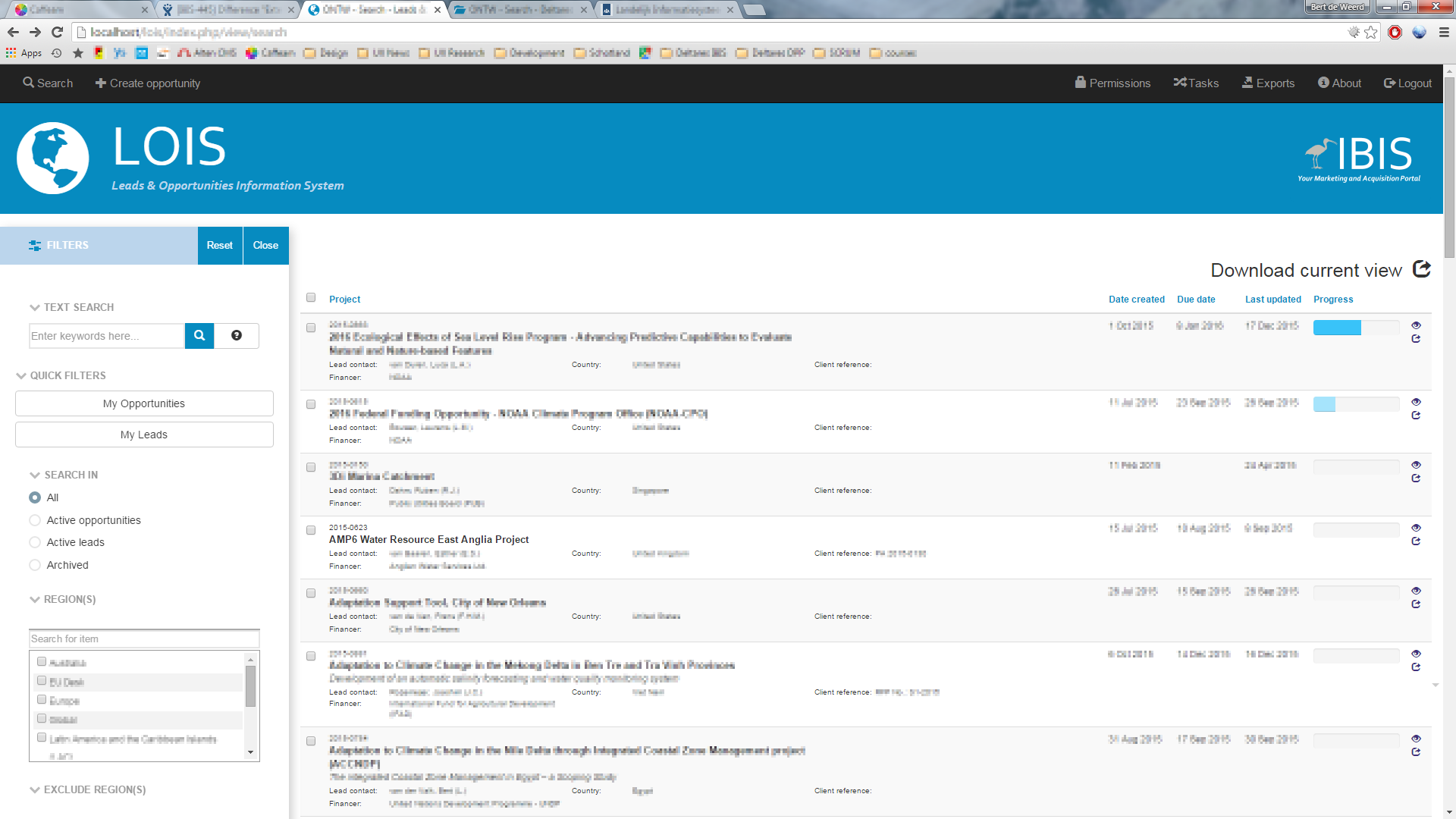
- Move from data generated UI to build for purpose UI. The choice for generated UI is often based on saving development resources and being flexible. While in some situations that might be useful, I haven’t seen any effective implementations of it. Users are adaptive and might accept the mostly tabular presentation of data, but that does not make it an effective way to present information for every situation.
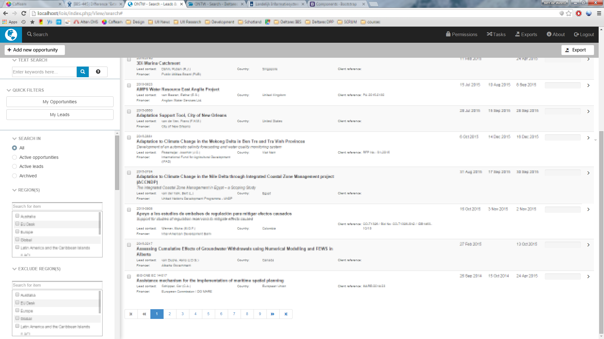
- Maximize the usable screen real estate. The interface needs scrolling, while some information needs to remain in view. Things like branding and navigation make room for display of more data.
- Connect organizational goals to product planning and feature roadmap backed by user/stakeholder voice.
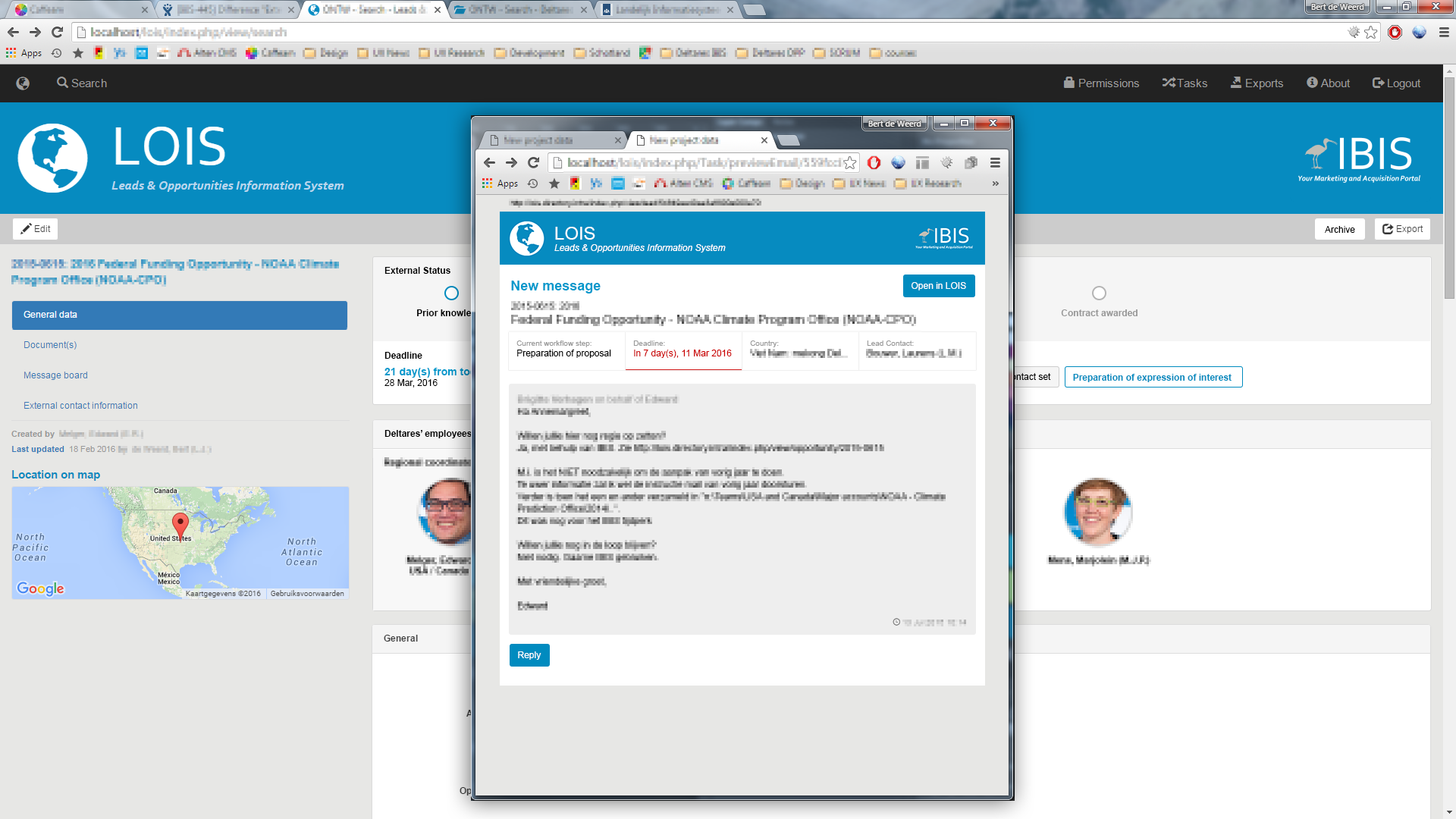
- Integration and connection of applications to break down silos of information and accelerate retrieval of related information.


Sometimes it helps to zoom out and see what’s available around you. If you can spot opportunities to help someone or a project, it might not be your ideal dream job, but it certainly can open some doors towards something in the right direction. There’s a say: “Rome wasn’t built within one day”. People and organizations don’t change easily, if you dear to take on such a challenge, also be sure to take your time and let them adapt in their own pace.
