Operator UI for a bell pepper grading robot
Posted on .
In a tight timeframe I helped Pliant to create a HMI for their new fruit and vegetables grading and sorting technology. The project included software and hardware in its scope. – As UX consultant I call this dream projects.
In general, factory machine operators need intuitive, easy to understand and glanceable information from the machinery they are operating. They often work in a (hostile) environment with bad light conditions, high noise levels and multiple assets that need their attention. While having mostly none or minor education, their cognitive load is massive, even as the tasks they perform look quite simple. For a HMI or UI to communicate with such a user, it is key to adapt to that context and support their tasks.
UX kickstart
The project involved a UX Kickstart, one of ALTEN’s propositions to help tech companies discover the value of the user experience domain. In a set time or budget one or more hypotheses are formed for research. Often a design mockup or future view is added to help the company some more on getting their product fly. Main topic for Pliant was to support the operator tasks, but during the iterative process, other questions and workflows popped up resulting in an extension of the assignment.
Operation
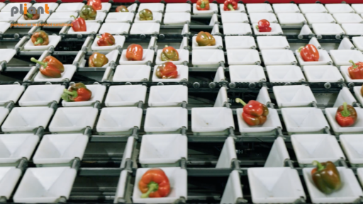
First research task that comes to mind in such a project is to emphasise with the context the product is used in. In this case a vegetable sorting machine used to grade and sort bell peppers that are being delivered by the farmer. The grading process is used to define the quality (which determines the value) of the product. The sorting process ensures that the peppers are grouped into quality ranges set by contracts of clients. The sorting and grading is somewhat an autonomous process. The operator therefore is often mainly occupied with the logistics of the crates/containers the peppers are placed in after grading and sorting. But they also oversee the progress and integrity of the whole process.
Dutch shoppers might know the traffic sign bags (stoplicht) in the grocery store filled with a red, orange and green bell pepper, which is a typical result of the sorting process. The grading and sorting process needs to ensure the three coloured peppers are in, but also within the quality boundaries of the contract by the client. For example, bell peppers that need to travel to clients abroad, need to be more fresh and of a higher quality to compensate for the journey.
High mental (base) load for operator
From interviews and observations on packaging plants, I’ve learned that the operators often need to handle multiple parallel tasks like controlling multiple orders on various machines. Interrupting events like truck drivers asking questions or mechanical failures ensure for distraction. The location itself is often loud though mechanical movement of machinery and lines of sight are often blocked by crates with products. The constantly moving products on conveyor belts add up to the distraction. Therefore an operator needs to focus narrowly on its task. This creates a challenge to attract attention from the operator to inform about status or progress. While handling multiple streams of information from all machines, the operator needs to choose between machines to listen to actively.
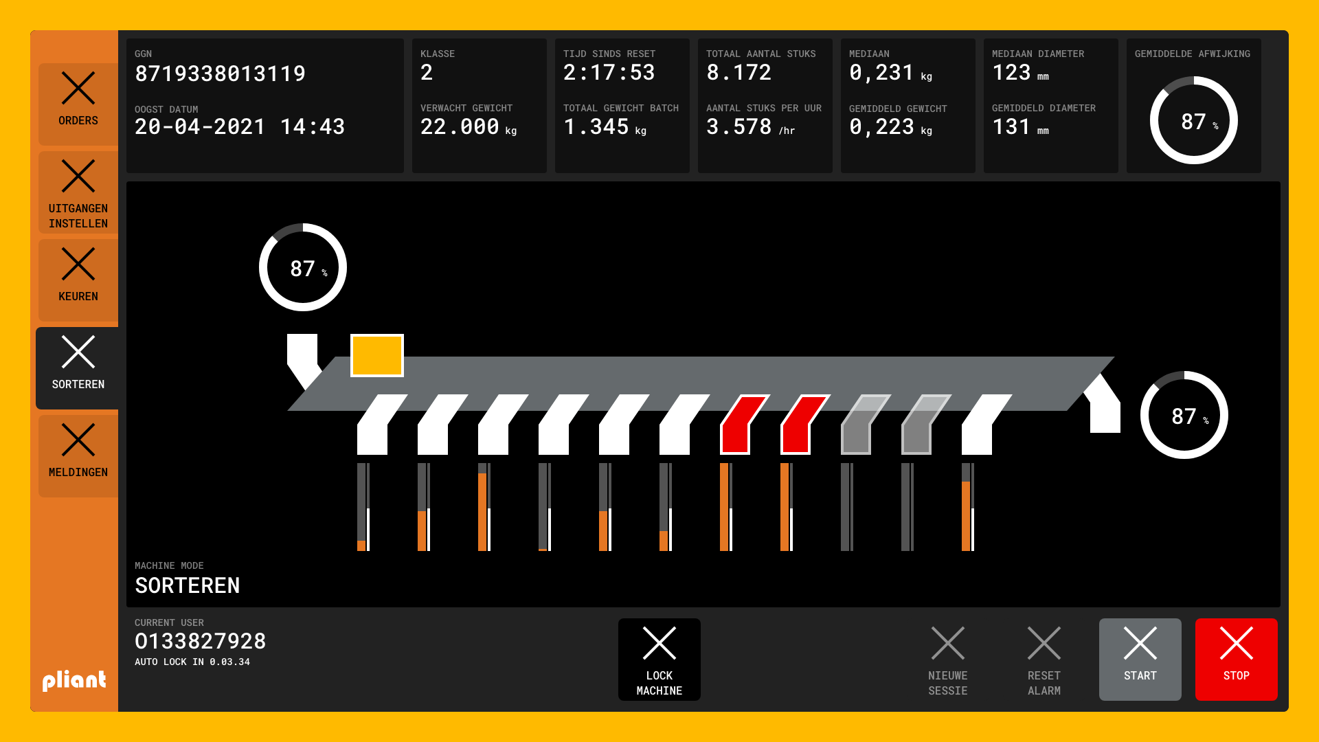
To attract an operators attention, we (the project team) choose to use both hardware and software signals to inform about status. Lights on a beam above the machine help to communicate the lowest level of status by color (red, yellow green) and light location (top – down). The software interface to operate the machine and start and select grading assignments also needed to communicate the status and progress. To supply a glanceable status overview, I presented a systematic display of the entire machine. Navigation from there allowed to obtain specific status information.

Other workflows
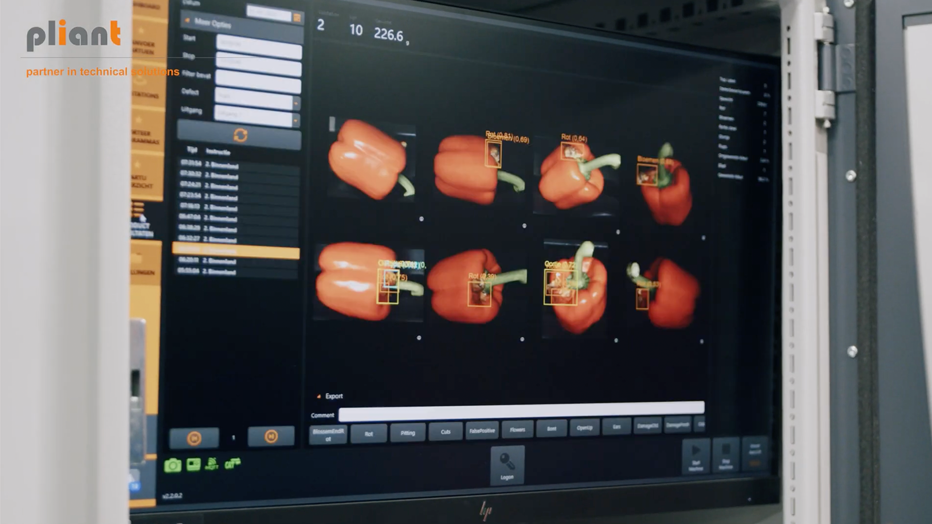
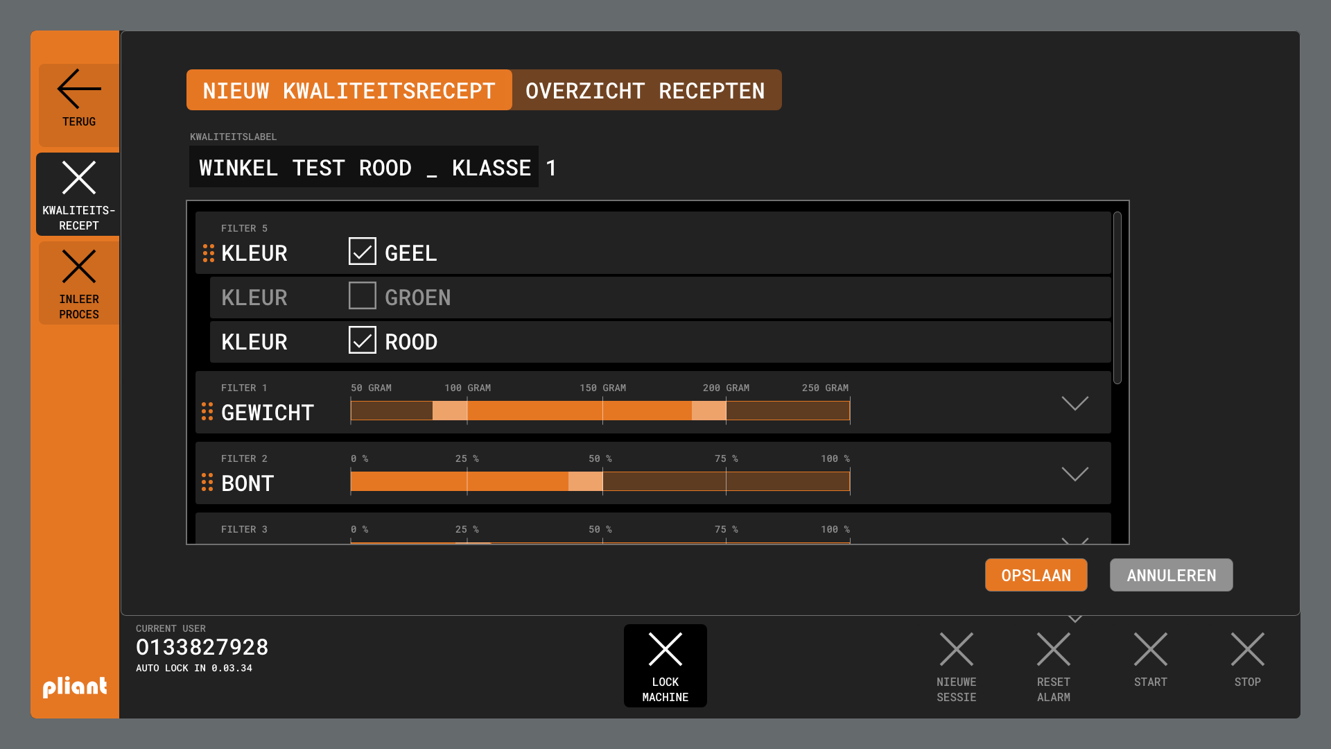
Having the operational part as the main research topic and deliverable for this project, there were other workflows that also needed some UX support. During the grading/sorting proces, a manager should be able to check performance and status of a sorting order. The HMI allows to inspect all data gathered during the grading and sorting process. The decisions made by the grading process, can be checked per product (bell pepper). When sorting results are not as desired, a user with sufficient rights is able to adjust the sorting parameters live while the order is running.


Outcome
While the project scope only involved research and production of mockups to test hypotheses, the ideas, advice and results are currently part of a product line by Pliant. A nice video is showing the product in action.
