Heuristic evaluation for validating design
Posted on .
Back in de early 90’s Jacob Nielsen provided us with a list of 10 golden rules that would give us an instrument to measure the performance of interface design. Those rules still apply perfectly and can be used to enhance your design process.
I must admit, I’m enthusiastic of the heuristic evaluation. It’s a great tool to get a good view and understanding on any products current state. Often I see it just used in an expert review at the start of projects. Mostly to find pain and the low hanging fruits. But I find it a great tool to also use during the design phase when you work solo on a project. Sometimes there’s simply not the luxury of a full stacked design team to work with. And in such situations, getting design critiques is still important. By using the heuristic evaluation as a tool for validating your own design decisions it will help you stay focused and sharp and therefore backup your designs.
I use them as a guide in my design concept document that’s keeping all my design decisions for a project. I use the heuristics as proof for well thought designs by linking a decision to the heuristics that apply.
Heuristic Evaluation
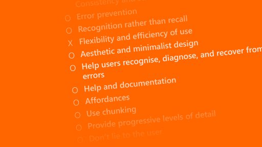
Next to the list by Nielsen, there are numerous others. Here’s my list of heuristics. It’s based on the 10 heuristics by Jacob Nielsen and its extension by the OCLC.
- Visibility of system status – The system should always keep users informed about what is going on, through appropriate feedback within reasonable time. Think of times when you pushed a button and had to wait a while for something to happen.
- Match between system and the real world – The system should speak the users’ language, with words, phrases and concepts familiar to the user, rather than system-oriented terms. Follow real-world conventions, making information appear in a natural and logical order. So the buttons on a controller for moving a robot’s arm left and right, should be positioned in such a matter that they would match the real world.
- User control and freedom – Users often choose system functions by mistake and will need a clearly marked “emergency exit” to leave the unwanted state without having to go through an extended dialogue. Support undo and redo. Let the user experiment.
- Consistency and standards – Users should not have to wonder whether different words, situations, or actions mean the same thing. Follow platform conventions. The color red is often used for danger and error, green for good or success. Don’t mess with what the user already knows.
- Error prevention – Even better than good error messages is a careful design, which prevents a problem from occurring in the first place. Either eliminate error-prone conditions or check for them and present users with a confirmation option before they commit to the action. Guide the user towards its goals.
- Recognition rather than recall – Minimise the user’s memory load by making objects, actions, and options visible. The user should not have to remember information from one part of the dialogue to another. Instructions for use of the system should be visible or easily retrievable whenever appropriate. What did you eat for breakfast the other day? Don’t have the user remember things as the design can do that.
- Flexibility and efficiency of use – Accelerators — unseen by the novice user — may often speed up the interaction for the expert user such that the system can cater to both inexperienced and experienced users. Allow users to tailor frequent actions. Stop having the user to do repetitive tasks, find them, and automate them.
- Aesthetic and minimalist design – Dialogues should not contain information which is irrelevant or rarely needed. Every extra unit of information in a dialogue competes with the relevant units of information and diminishes their relative visibility. Distraction is a bad thing for interfaces.
- Help users recognise, diagnose, and recover from errors – Error messages should be expressed in plain language (no codes), precisely indicate the problem, and constructively suggest a solution. There’s no human on the planet that can relate to “Error X281928.2928”. Help the user recover.
- Help and documentation – Even though it is better if the system can be used without documentation, it may be necessary to provide help and documentation. Any such information should be easy to search, focused on the user’s task, list concrete steps to be carried out, and not be too large. Write documentation, if only to make sure your design is still valid to your goals.
- Affordances – Does the user understand what the text/graphic will do before they activate it?
- Use chunking – Write material so that documents are short and contain exactly one topic. Do not force the user to access multiple documents to complete a single thought. Do not soak the user in information. If the user can’t act on all information at once, simply don’t pretend to.
- Provide progressive levels of detail – Organise information hierarchically, with more general information appearing before more specific detail. Encourage the user to delve as deeply as needed, but to stop whenever sufficient information has been received.
- Don’t lie to the user – Eliminate erroneous or misleading routes. Do not refer to missing information/functions.
